4.1. Plotting Data with Pandas#
4.1.1. Importing the DataFrame#
This notebook begins Part 3 of this textbook. Here, we will build upon our skills from Parts 1 and 2, and begin exploring how to visualize data in Pandas. Pandas sits on top of Matplotlib, one of the standard libraries used by data scientists for plotting data. As we will see in the next notebooks, you can also leverage other, more robust graphing libraries through Pandas. For now, though, let’s start with the basics. In this notebook, we will explore how to create three types of graphs: bar (and barh), pie, and scatter. I will also introduce you to some of the more recent features of Pandas 1.3.0, that allow you to control the graph a bit more.
Before we do any of that, however, let’s import pandas and our data.
import pandas as pd
df = pd.read_csv("../data/titanic.csv")
df
| PassengerId | Survived | Pclass | Name | Sex | Age | SibSp | Parch | Ticket | Fare | Cabin | Embarked | |
|---|---|---|---|---|---|---|---|---|---|---|---|---|
| 0 | 1 | 0 | 3 | Braund, Mr. Owen Harris | male | 22.0 | 1 | 0 | A/5 21171 | 7.2500 | NaN | S |
| 1 | 2 | 1 | 1 | Cumings, Mrs. John Bradley (Florence Briggs Th... | female | 38.0 | 1 | 0 | PC 17599 | 71.2833 | C85 | C |
| 2 | 3 | 1 | 3 | Heikkinen, Miss. Laina | female | 26.0 | 0 | 0 | STON/O2. 3101282 | 7.9250 | NaN | S |
| 3 | 4 | 1 | 1 | Futrelle, Mrs. Jacques Heath (Lily May Peel) | female | 35.0 | 1 | 0 | 113803 | 53.1000 | C123 | S |
| 4 | 5 | 0 | 3 | Allen, Mr. William Henry | male | 35.0 | 0 | 0 | 373450 | 8.0500 | NaN | S |
| ... | ... | ... | ... | ... | ... | ... | ... | ... | ... | ... | ... | ... |
| 886 | 887 | 0 | 2 | Montvila, Rev. Juozas | male | 27.0 | 0 | 0 | 211536 | 13.0000 | NaN | S |
| 887 | 888 | 1 | 1 | Graham, Miss. Margaret Edith | female | 19.0 | 0 | 0 | 112053 | 30.0000 | B42 | S |
| 888 | 889 | 0 | 3 | Johnston, Miss. Catherine Helen "Carrie" | female | NaN | 1 | 2 | W./C. 6607 | 23.4500 | NaN | S |
| 889 | 890 | 1 | 1 | Behr, Mr. Karl Howell | male | 26.0 | 0 | 0 | 111369 | 30.0000 | C148 | C |
| 890 | 891 | 0 | 3 | Dooley, Mr. Patrick | male | 32.0 | 0 | 0 | 370376 | 7.7500 | NaN | Q |
891 rows × 12 columns
4.1.2. Bar and Barh Charts with Pandas#
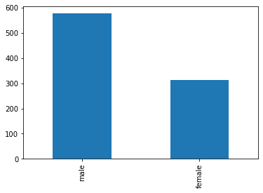
With our data imported successfully, let’s jump right in with bar charts. Bar charts a great way to visualize qualitative data quantitatively. To demonstrate what I mean by this, let’s consider if we wanted to know how many male passengers were on the Titanic relative to female passengers. I could grab all the value counts and look at the numbers by calling .value_counts(), as in the example below.
df['Sex'].value_counts()
male      577
female    314
Name: Sex, dtype: int64
This kind of raw numerical data is useful, but it is often difficult to present visually to audiences. For this reason, it is quite common to have the raw numerical data available, but to give the audience a quick sense of the numbers visually. We can take that initial code we see above and append two other methods to it .plot.bar() and we get the following result.
df['Sex'].value_counts().plot.bar()
<matplotlib.axes._subplots.AxesSubplot at 0x1b2877751c0>
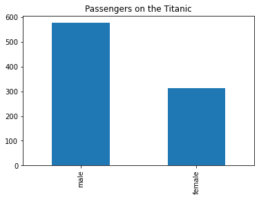
Not bad, but this chart is quite staid. For one thing, we don’t even have a title! Let’s fix that. We can pass a keyword argument of title. This will take a string.
df['Sex'].value_counts().plot.bar(title="Passengers on the Titanic")
<matplotlib.axes._subplots.AxesSubplot at 0x1b2e64cdf10>
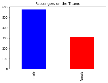
We have another serious issue, though. Both types of gender are represented with the same color. This can be difficult for audiences to decipher in some instances, so let’s change that. We can pass the keyword argument of color which will take a list of colors.
df['Sex'].value_counts().plot.bar(title="Passengers on the Titanic", color=["blue", "red"])
<matplotlib.axes._subplots.AxesSubplot at 0x1b289804040>
df['Sex'].value_counts().plot.bar(title="Passengers on the Titanic", color=["blue", "red"])
<matplotlib.axes._subplots.AxesSubplot at 0x1b28a8d52e0>
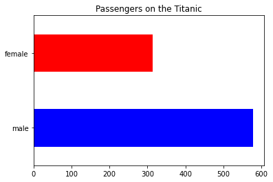
We can do the same thing with a barh graph, or a bar-horizontal graph.
df['Sex'].value_counts().plot.barh(title="Passengers on the Titanic", color=["blue", "red"])
<matplotlib.axes._subplots.AxesSubplot at 0x1b28a93d460>
4.1.3. Pie Charts with Pandas#
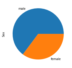
df['Sex'].value_counts().plot.pie()
<matplotlib.axes._subplots.AxesSubplot at 0x1b28a990250>
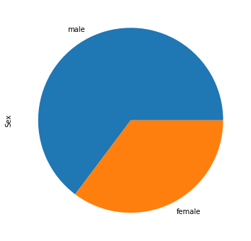
df['Sex'].value_counts().plot.pie(figsize=(6, 6))
<matplotlib.axes._subplots.AxesSubplot at 0x1b28a9db490>
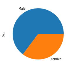
Let’s say I was interested in the title of the genders not being lowercase. I can add in some custom labels to the data as a keyword argument, labels, which takes a list.
df['Sex'].value_counts().plot.pie(labels=["Male", "Female"])
<matplotlib.axes._subplots.AxesSubplot at 0x1b28aa1b100>
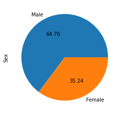
Now that we have our labels as we want them, let’s give thee audience a bit of a better experience. Let’s allow them to easily see the percentage of each gender, not just visually, but quantitatively. To do this, we can pass the keyword argument, autopct, which will take a string. In this case, we can pass in the argument “%.2f” which is a formatted string. This argument will convert our data into a percentage.
df['Sex'].value_counts().plot.pie(labels=["Male", "Female"], autopct="%.2f")
<matplotlib.axes._subplots.AxesSubplot at 0x1b28aa0ecd0>
4.1.4. Scatter Plots with Pandas#
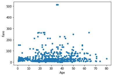
Scatter plots allow us to plot qualitative data quantitatively in relation to two numerical attributes. Let’s imagine that we are interested in exploring all passengers, something qualitative. Now, we want to know how each passenger relates to other passengers on two numerical, or quantitative attributes, e.g. the age of the passenger and the fare that they paid. Both of these are quantitative. We can therefore represent each person as a point on the scatter plot and plot them in relation to their fare (vertical, or y axis) and age (horizontal, or x axis) on the graph.
In Pandas we can do this by passing two keyword arguments, x and y and set them both equal to the DataFramee column we want, e.g. “Age” and “Fare”.
df.plot.scatter(x="Age", y="Fare")
<matplotlib.axes._subplots.AxesSubplot at 0x1b28a99f9a0>
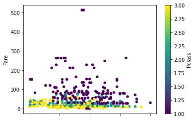
That looks good, but we can do better. Let’s try to color coordinate this data. Let’s say we are interested in seeing not only the passenger’s age and fare, but we’re also interested in color-coordinating the graph so that their Pclass effects the color of each plot. We can do this by passing a few new keyword arguments.
c=”Pclass” => c will be the column that affects the color
cmap=”virdis” => will be the color map we want to use (these are built into Pandas)
df.plot.scatter(x="Age", y="Fare", c="Pclass",cmap="viridis")
<matplotlib.axes._subplots.AxesSubplot at 0x1b28aaf2310>
This is starting to look a lot better now. But let’s say we didn’t want to represent our data as a series of marginally changing numbers. When we pass a DataFrame column to c as a set of numbers, Pandas presumes that that number corresponds to a gradient change in color. But passenger class is not a gradient change, it is a integral change, meaning no one will be Pclass 1.2. They will be 1, 2, or 3. In order to fix this graph, we can make a few changes. First, we can use df.loc that we met in a previous notebook to grab all classes. Now, we know there are three. We can convert these from numerical representations of the class into string representations, e.g. First, Second, and Third.
Next, we can convert that entire column from a string column into a Pandas Categorical Class.
df.loc[(df.Pclass == 1),'Pclass']="First"
df.loc[(df.Pclass == 2),'Pclass']="Second"
df.loc[(df.Pclass == 3),'Pclass']="Third"
We can now see that our data has now been altered in the Pclass column.
df
| PassengerId | Survived | Pclass | Name | Sex | Age | SibSp | Parch | Ticket | Fare | Cabin | Embarked | |
|---|---|---|---|---|---|---|---|---|---|---|---|---|
| 0 | 1 | 0 | Third | Braund, Mr. Owen Harris | male | 22.0 | 1 | 0 | A/5 21171 | 7.2500 | NaN | S |
| 1 | 2 | 1 | First | Cumings, Mrs. John Bradley (Florence Briggs Th... | female | 38.0 | 1 | 0 | PC 17599 | 71.2833 | C85 | C |
| 2 | 3 | 1 | Third | Heikkinen, Miss. Laina | female | 26.0 | 0 | 0 | STON/O2. 3101282 | 7.9250 | NaN | S |
| 3 | 4 | 1 | First | Futrelle, Mrs. Jacques Heath (Lily May Peel) | female | 35.0 | 1 | 0 | 113803 | 53.1000 | C123 | S |
| 4 | 5 | 0 | Third | Allen, Mr. William Henry | male | 35.0 | 0 | 0 | 373450 | 8.0500 | NaN | S |
| ... | ... | ... | ... | ... | ... | ... | ... | ... | ... | ... | ... | ... |
| 886 | 887 | 0 | Second | Montvila, Rev. Juozas | male | 27.0 | 0 | 0 | 211536 | 13.0000 | NaN | S |
| 887 | 888 | 1 | First | Graham, Miss. Margaret Edith | female | 19.0 | 0 | 0 | 112053 | 30.0000 | B42 | S |
| 888 | 889 | 0 | Third | Johnston, Miss. Catherine Helen "Carrie" | female | NaN | 1 | 2 | W./C. 6607 | 23.4500 | NaN | S |
| 889 | 890 | 1 | First | Behr, Mr. Karl Howell | male | 26.0 | 0 | 0 | 111369 | 30.0000 | C148 | C |
| 890 | 891 | 0 | Third | Dooley, Mr. Patrick | male | 32.0 | 0 | 0 | 370376 | 7.7500 | NaN | Q |
891 rows × 12 columns
Now that our data is successfully converted into a string, you might be thinking that we can run the same code as before and we should see the data divided between strings, rather than a gradient shift between floats. If we execute the cell below, however, we get a rather large and scary looking error. (Scroll down to see the solution).
df.plot.scatter(x="Age", y="Fare", c="Pclass", cmap="viridis", s=50)
---------------------------------------------------------------------------
ValueError                                Traceback (most recent call last)
File ~\anaconda3\lib\site-packages\matplotlib\axes\_axes.py:4239, in Axes._parse_scatter_color_args(c, edgecolors, kwargs, xsize, get_next_color_func)
   4238 try:  # Is 'c' acceptable as PathCollection facecolors?
-> 4239     colors = mcolors.to_rgba_array(c)
   4240 except ValueError:

File ~\anaconda3\lib\site-packages\matplotlib\colors.py:340, in to_rgba_array(c, alpha)
    339 else:
--> 340     return np.array([to_rgba(cc, alpha) for cc in c])

File ~\anaconda3\lib\site-packages\matplotlib\colors.py:340, in <listcomp>(.0)
    339 else:
--> 340     return np.array([to_rgba(cc, alpha) for cc in c])

File ~\anaconda3\lib\site-packages\matplotlib\colors.py:185, in to_rgba(c, alpha)
    184 if rgba is None:  # Suppress exception chaining of cache lookup failure.
--> 185     rgba = _to_rgba_no_colorcycle(c, alpha)
    186     try:

File ~\anaconda3\lib\site-packages\matplotlib\colors.py:261, in _to_rgba_no_colorcycle(c, alpha)
    260         return c, c, c, alpha if alpha is not None else 1.
--> 261     raise ValueError(f"Invalid RGBA argument: {orig_c!r}")
    262 # tuple color.

ValueError: Invalid RGBA argument: 'Third'

During handling of the above exception, another exception occurred:

ValueError                                Traceback (most recent call last)
Input In [18], in <cell line: 1>()
----> 1 df.plot.scatter(x="Age", y="Fare", c="Pclass", cmap="viridis", s=50)

File ~\AppData\Roaming\Python\Python38\site-packages\pandas\plotting\_core.py:1636, in PlotAccessor.scatter(self, x, y, s, c, **kwargs)
   1553 def scatter(self, x, y, s=None, c=None, **kwargs):
   1554     """
   1555     Create a scatter plot with varying marker point size and color.
   1556
   (...)
   1634         ...                       colormap='viridis')
   1635     """
-> 1636     return self(kind="scatter", x=x, y=y, s=s, c=c, **kwargs)

File ~\AppData\Roaming\Python\Python38\site-packages\pandas\plotting\_core.py:917, in PlotAccessor.__call__(self, *args, **kwargs)
    915 if kind in self._dataframe_kinds:
    916     if isinstance(data, ABCDataFrame):
--> 917         return plot_backend.plot(data, x=x, y=y, kind=kind, **kwargs)
    918     else:
    919         raise ValueError(f"plot kind {kind} can only be used for data frames")

File ~\AppData\Roaming\Python\Python38\site-packages\pandas\plotting\_matplotlib\__init__.py:71, in plot(data, kind, **kwargs)
     69         kwargs["ax"] = getattr(ax, "left_ax", ax)
     70 plot_obj = PLOT_CLASSES[kind](data, **kwargs)
---> 71 plot_obj.generate()
     72 plot_obj.draw()
     73 return plot_obj.result

File ~\AppData\Roaming\Python\Python38\site-packages\pandas\plotting\_matplotlib\core.py:288, in MPLPlot.generate(self)
    286 self._compute_plot_data()
    287 self._setup_subplots()
--> 288 self._make_plot()
    289 self._add_table()
    290 self._make_legend()

File ~\AppData\Roaming\Python\Python38\site-packages\pandas\plotting\_matplotlib\core.py:1070, in ScatterPlot._make_plot(self)
   1068 else:
   1069     label = None
-> 1070 scatter = ax.scatter(
   1071     data[x].values,
   1072     data[y].values,
   1073     c=c_values,
   1074     label=label,
   1075     cmap=cmap,
   1076     norm=norm,
   1077     **self.kwds,
   1078 )
   1079 if cb:
   1080     cbar_label = c if c_is_column else ""

File ~\anaconda3\lib\site-packages\matplotlib\__init__.py:1565, in _preprocess_data.<locals>.inner(ax, data, *args, **kwargs)
   1562 @functools.wraps(func)
   1563 def inner(ax, *args, data=None, **kwargs):
   1564     if data is None:
-> 1565         return func(ax, *map(sanitize_sequence, args), **kwargs)
   1567     bound = new_sig.bind(ax, *args, **kwargs)
   1568     auto_label = (bound.arguments.get(label_namer)
   1569                   or bound.kwargs.get(label_namer))

File ~\anaconda3\lib\site-packages\matplotlib\cbook\deprecation.py:358, in _delete_parameter.<locals>.wrapper(*args, **kwargs)
    352 if name in arguments and arguments[name] != _deprecated_parameter:
    353     warn_deprecated(
    354         since, message=f"The {name!r} parameter of {func.__name__}() "
    355         f"is deprecated since Matplotlib {since} and will be removed "
    356         f"%(removal)s.  If any parameter follows {name!r}, they "
    357         f"should be pass as keyword, not positionally.")
--> 358 return func(*args, **kwargs)

File ~\anaconda3\lib\site-packages\matplotlib\axes\_axes.py:4401, in Axes.scatter(self, x, y, s, c, marker, cmap, norm, vmin, vmax, alpha, linewidths, verts, edgecolors, plotnonfinite, **kwargs)
   4397 if len(s) not in (1, x.size):
   4398     raise ValueError("s must be a scalar, or the same size as x and y")
   4400 c, colors, edgecolors = \
-> 4401     self._parse_scatter_color_args(
   4402         c, edgecolors, kwargs, x.size,
   4403         get_next_color_func=self._get_patches_for_fill.get_next_color)
   4405 if plotnonfinite and colors is None:
   4406     c = np.ma.masked_invalid(c)

File ~\anaconda3\lib\site-packages\matplotlib\axes\_axes.py:4245, in Axes._parse_scatter_color_args(c, edgecolors, kwargs, xsize, get_next_color_func)
   4242         raise invalid_shape_exception(c.size, xsize)
   4243     # Both the mapping *and* the RGBA conversion failed: pretty
   4244     # severe failure => one may appreciate a verbose feedback.
-> 4245     raise ValueError(
   4246         f"'c' argument must be a color, a sequence of colors, or "
   4247         f"a sequence of numbers, not {c}")
   4248 else:
   4249     if len(colors) not in (0, 1, xsize):
   4250         # NB: remember that a single color is also acceptable.
   4251         # Besides *colors* will be an empty array if c == 'none'.

ValueError: 'c' argument must be a color, a sequence of colors, or a sequence of numbers, not ['Third' 'First' 'Third' 'First' 'Third' 'Third' 'First' 'Third' 'Third'
 'Second' 'Third' 'First' 'Third' 'Third' 'Third' 'Second' 'Third'
 'Second' 'Third' 'Third' 'Second' 'Second' 'Third' 'First' 'Third'
 'Third' 'Third' 'First' 'Third' 'Third' 'First' 'First' 'Third' 'Second'
 'First' 'First' 'Third' 'Third' 'Third' 'Third' 'Third' 'Second' 'Third'
 'Second' 'Third' 'Third' 'Third' 'Third' 'Third' 'Third' 'Third' 'Third'
 'First' 'Second' 'First' 'First' 'Second' 'Third' 'Second' 'Third'
 'Third' 'First' 'First' 'Third' 'First' 'Third' 'Second' 'Third' 'Third'
 'Third' 'Second' 'Third' 'Second' 'Third' 'Third' 'Third' 'Third' 'Third'
 'Second' 'Third' 'Third' 'Third' 'Third' 'First' 'Second' 'Third' 'Third'
 'Third' 'First' 'Third' 'Third' 'Third' 'First' 'Third' 'Third' 'Third'
 'First' 'First' 'Second' 'Second' 'Third' 'Third' 'First' 'Third' 'Third'
 'Third' 'Third' 'Third' 'Third' 'Third' 'First' 'Third' 'Third' 'Third'
 'Third' 'Third' 'Third' 'Second' 'First' 'Third' 'Second' 'Third'
 'Second' 'Second' 'First' 'Third' 'Third' 'Third' 'Third' 'Third' 'Third'
 'Third' 'Third' 'Second' 'Second' 'Second' 'First' 'First' 'Third'
 'First' 'Third' 'Third' 'Third' 'Third' 'Second' 'Second' 'Third' 'Third'
 'Second' 'Second' 'Second' 'First' 'Third' 'Third' 'Third' 'First'
 'Third' 'Third' 'Third' 'Third' 'Third' 'Second' 'Third' 'Third' 'Third'
 'Third' 'First' 'Third' 'First' 'Third' 'First' 'Third' 'Third' 'Third'
 'First' 'Third' 'Third' 'First' 'Second' 'Third' 'Third' 'Second' 'Third'
 'Second' 'Third' 'First' 'Third' 'First' 'Third' 'Third' 'Second'
 'Second' 'Third' 'Second' 'First' 'First' 'Third' 'Third' 'Third'
 'Second' 'Third' 'Third' 'Third' 'Third' 'Third' 'Third' 'Third' 'Third'
 'Third' 'First' 'Third' 'Second' 'Third' 'Second' 'Third' 'First' 'Third'
 'Second' 'First' 'Second' 'Third' 'Second' 'Third' 'Third' 'First'
 'Third' 'Second' 'Third' 'Second' 'Third' 'First' 'Third' 'Second'
 'Third' 'Second' 'Third' 'Second' 'Second' 'Second' 'Second' 'Third'
 'Third' 'Second' 'Third' 'Third' 'First' 'Third' 'Second' 'First'
 'Second' 'Third' 'Third' 'First' 'Third' 'Third' 'Third' 'First' 'First'
 'First' 'Second' 'Third' 'Third' 'First' 'First' 'Third' 'Second' 'Third'
 'Third' 'First' 'First' 'First' 'Third' 'Second' 'First' 'Third' 'First'
 'Third' 'Second' 'Third' 'Third' 'Third' 'Third' 'Third' 'Third' 'First'
 'Third' 'Third' 'Third' 'Second' 'Third' 'First' 'First' 'Second' 'Third'
 'Third' 'First' 'Third' 'First' 'First' 'First' 'Third' 'Third' 'Third'
 'Second' 'Third' 'First' 'First' 'First' 'Second' 'First' 'First' 'First'
 'Second' 'Third' 'Second' 'Third' 'Second' 'Second' 'First' 'First'
 'Third' 'Third' 'Second' 'Second' 'Third' 'First' 'Third' 'Second'
 'Third' 'First' 'Third' 'First' 'First' 'Third' 'First' 'Third' 'First'
 'First' 'Third' 'First' 'Second' 'First' 'Second' 'Second' 'Second'
 'Second' 'Second' 'Third' 'Third' 'Third' 'Third' 'First' 'Third' 'Third'
 'Third' 'Third' 'First' 'Second' 'Third' 'Third' 'Third' 'Second' 'Third'
 'Third' 'Third' 'Third' 'First' 'Third' 'Third' 'First' 'First' 'Third'
 'Third' 'First' 'Third' 'First' 'Third' 'First' 'Third' 'Third' 'First'
 'Third' 'Third' 'First' 'Third' 'Second' 'Third' 'Second' 'Third'
 'Second' 'First' 'Third' 'Third' 'First' 'Third' 'Third' 'Third' 'Second'
 'Second' 'Second' 'Third' 'Third' 'Third' 'Third' 'Third' 'Second'
 'Third' 'Second' 'Third' 'Third' 'Third' 'Third' 'First' 'Second' 'Third'
 'Third' 'Second' 'Second' 'Second' 'Third' 'Third' 'Third' 'Third'
 'Third' 'Third' 'Third' 'Second' 'Second' 'Third' 'Third' 'First' 'Third'
 'Second' 'Third' 'First' 'First' 'Third' 'Second' 'First' 'Second'
 'Second' 'Third' 'Third' 'Second' 'Third' 'First' 'Second' 'First'
 'Third' 'First' 'Second' 'Third' 'First' 'First' 'Third' 'Third' 'First'
 'First' 'Second' 'Third' 'First' 'Third' 'First' 'Second' 'Third' 'Third'
 'Second' 'First' 'Third' 'Third' 'Third' 'Third' 'Second' 'Second'
 'Third' 'First' 'Second' 'Third' 'Third' 'Third' 'Third' 'Second' 'Third'
 'Third' 'First' 'Third' 'First' 'First' 'Third' 'Third' 'Third' 'Third'
 'First' 'First' 'Third' 'Third' 'First' 'Third' 'First' 'Third' 'Third'
 'Third' 'Third' 'Third' 'First' 'First' 'Second' 'First' 'Third' 'Third'
 'Third' 'Third' 'First' 'First' 'Third' 'First' 'Second' 'Third' 'Second'
 'Third' 'First' 'Third' 'Third' 'First' 'Third' 'Third' 'Second' 'First'
 'Third' 'Second' 'Second' 'Third' 'Third' 'Third' 'Third' 'Second'
 'First' 'First' 'Third' 'First' 'First' 'Third' 'Third' 'Second' 'First'
 'First' 'Second' 'Second' 'Third' 'Second' 'First' 'Second' 'Third'
 'Third' 'Third' 'First' 'First' 'First' 'First' 'Third' 'Third' 'Third'
 'Second' 'Third' 'Third' 'Third' 'Third' 'Third' 'Third' 'Third' 'Second'
 'First' 'First' 'Third' 'Third' 'Third' 'Second' 'First' 'Third' 'Third'
 'Second' 'First' 'Second' 'First' 'Third' 'First' 'Second' 'First'
 'Third' 'Third' 'Third' 'First' 'Third' 'Third' 'Second' 'Third' 'Second'
 'Third' 'Third' 'First' 'Second' 'Third' 'First' 'Third' 'First' 'Third'
 'Third' 'First' 'Second' 'First' 'Third' 'Third' 'Third' 'Third' 'Third'
 'Second' 'Third' 'Third' 'Second' 'Second' 'Third' 'First' 'Third'
 'Third' 'Third' 'First' 'Second' 'First' 'Third' 'Third' 'First' 'Third'
 'First' 'First' 'Third' 'Second' 'Third' 'Second' 'Third' 'Third' 'Third'
 'First' 'Third' 'Third' 'Third' 'First' 'Third' 'First' 'Third' 'Third'
 'Third' 'Second' 'Third' 'Third' 'Third' 'Second' 'Third' 'Third'
 'Second' 'First' 'First' 'Third' 'First' 'Third' 'Third' 'Second'
 'Second' 'Third' 'Third' 'First' 'Second' 'First' 'Second' 'Second'
 'Second' 'Third' 'Third' 'Third' 'Third' 'First' 'Third' 'First' 'Third'
 'Third' 'Second' 'Second' 'Third' 'Third' 'Third' 'First' 'First' 'Third'
 'Third' 'Third' 'First' 'Second' 'Third' 'Third' 'First' 'Third' 'First'
 'First' 'Third' 'Third' 'Third' 'Second' 'Second' 'First' 'First' 'Third'
 'First' 'First' 'First' 'Third' 'Second' 'Third' 'First' 'Second' 'Third'
 'Third' 'Second' 'Third' 'Second' 'Second' 'First' 'Third' 'Second'
 'Third' 'Second' 'Third' 'First' 'Third' 'Second' 'Second' 'Second'
 'Third' 'Third' 'First' 'Third' 'Third' 'First' 'First' 'First' 'Third'
 'Third' 'First' 'Third' 'Second' 'First' 'Third' 'Second' 'Third' 'Third'
 'Third' 'Second' 'Second' 'Third' 'Second' 'Third' 'First' 'Third'
 'Third' 'Third' 'First' 'Third' 'First' 'First' 'Third' 'Third' 'Third'
 'Third' 'Third' 'Second' 'Third' 'Second' 'Third' 'Third' 'Third' 'Third'
 'First' 'Third' 'First' 'First' 'Third' 'Third' 'Third' 'Third' 'Third'
 'Third' 'First' 'Third' 'Second' 'Third' 'First' 'Third' 'Second' 'First'
 'Third' 'Third' 'Third' 'Second' 'Second' 'First' 'Third' 'Third' 'Third'
 'First' 'Third' 'Second' 'First' 'Third' 'Third' 'Second' 'Third' 'Third'
 'First' 'Third' 'Second' 'Third' 'Third' 'First' 'Third' 'First' 'Third'
 'Third' 'Third' 'Third' 'Second' 'Third' 'First' 'Third' 'Second' 'Third'
 'Third' 'Third' 'First' 'Third' 'Third' 'Third' 'First' 'Third' 'Second'
 'First' 'Third' 'Third' 'Third' 'Third' 'Third' 'Second' 'First' 'Third'
 'Third' 'Third' 'First' 'Second' 'Third' 'First' 'First' 'Third' 'Third'
 'Third' 'Second' 'First' 'Third' 'Second' 'Second' 'Second' 'First'
 'Third' 'Third' 'Third' 'First' 'First' 'Third' 'Second' 'Third' 'Third'
 'Third' 'Third' 'First' 'Second' 'Third' 'Third' 'Second' 'Third' 'Third'
 'Second' 'First' 'Third' 'First' 'Third']
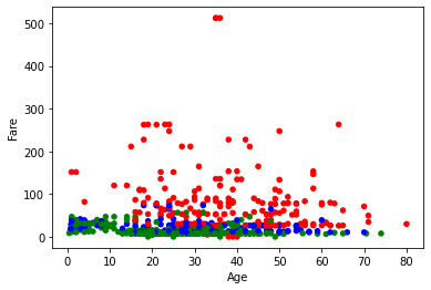
Keeping this massive error in the textbook is essential, despite its size being rather annoying. It tells us a lot of information about the problem. When we try and pass a keyword argument of c, Pandas is expecting a series of numbers (which will correspond to gradient shifts in the cmap), a list of colors, or a Pandas Categorical column. To change our data to a list of colors, let’s convert our data into three different colors.
df.loc[(df.Pclass == "First"),'Pclass']="red"
df.loc[(df.Pclass == "Second"),'Pclass']="blue"
df.loc[(df.Pclass == "Third"),'Pclass']="green"
df.plot.scatter(x="Age", y="Fare", c="Pclass")
<matplotlib.axes._subplots.AxesSubplot at 0x1b286ac0c10>
Now, our plots are all color coordinated. But I don’t like this. It doesn’t have a nice ledger to read. Instead, we should convert this data into a Categorical Column. To do this, let’s first get our data back into First, Second, and Third class format.
df.loc[(df.Pclass == "red"),'Pclass']="First"
df.loc[(df.Pclass == "blue"),'Pclass']="Second"
df.loc[(df.Pclass == "green"),'Pclass']="Third"
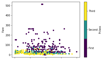
Now, let’s try this again by first converting Pclass into a Categorical type.
df['Pclass'] = df.Pclass.astype('category')
df.plot.scatter(x="Age", y="Fare", c="Pclass", cmap="viridis")
<matplotlib.axes._subplots.AxesSubplot at 0x1b28e20b4f0>
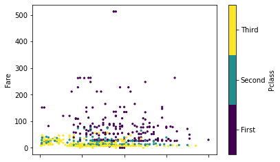
Now, like magic, we have precisely what we want to see. But we can do even better! Let’s say we don’t like the size of the nodes (points) on the graph. We want to see smaller nodes to distinguish better between the points. We can pass another keyword argument, s, which stands for size. This expects an integer.
df.plot.scatter(x="Age", y="Fare", c="Pclass", cmap="viridis", s=5)
<matplotlib.axes._subplots.AxesSubplot at 0x1b28f28f100>
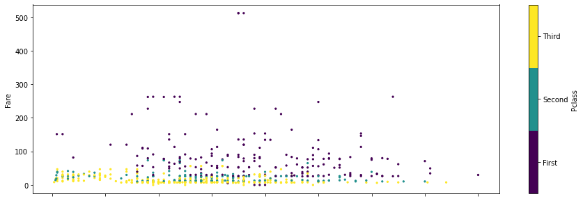
To make it a bit easier to read, let’s also adjust the size a bit. We can do this by passing the keyword argument, figsize, that we saw above with pie chars.
df.plot.scatter(x="Age", y="Fare", c="Pclass", cmap="viridis", s=5, figsize=(15,5))
<matplotlib.axes._subplots.AxesSubplot at 0x1b28f308340>
By now, you should have a good sense of how to create simple bar, pie, and scatter charts. In the next few notebooks, we will be looking at other ways of leveraging Pandas to produce visualizations, such as using plotly and social networks with networkx.