2.1. Data Visualization#
When working with large quantities of data, it can often be difficult to present that data in a way that makes sense to non-experts. In these situations, we often rely on some form of chart to represent our data. Creating quality graphs in Python requires a lot of practice, but quality charts can be produced with Matplotlib, Altair, PyDeck, PyVis, Plotly, and Bokeh. Each has their own strengths. In this section, we will not go into these libraries, rather we will focus on how to present these different types of graphs in Streamlit.
In Streamlit, we can leverage these libraries to produce visually appealing charts in just a few lines of code. We will focus on three types of graphs: Basic Plot Graphs, Map Graphs, and Network Graphs.
2.1.1. Metrics#
Before we address plots, we should spend a brief moment and think about how we display raw numerical quantitative data. We could display the length of a dataframe or the word count of some text st.write(). Again, while this would be quick to do, it would not allow you to display other important information, such as how that number has changed from a previous state. Nor would it allow you to easily represent the change in a positive or negative direction without complex JavaScript and HTML. In these scenarios, we would want to use st.metric().
By default, the metric will display a numerical output of some sort. This number could also be a string representation of a number, e.g. temperature. Let’s say, we wanted to create a simple application where a user could copy-and-paste some text into a st.text_area() field. The app would split up the words at every white space and then provide the user with the total word count.
import streamlit as st
text = st.text_area("Paste text here to get word count.", "This is some default text.")
word_count = len(text.split())
st.metric("Word Count", word_count)
The output will look like this:
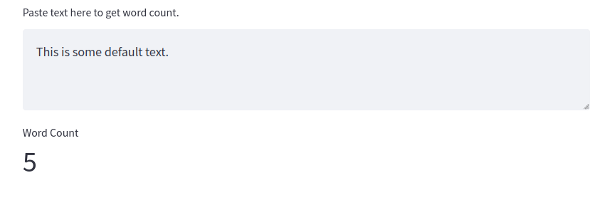
Fig. 2.1 Example of Standard st.metric() Widget()#
Since we are using the st.metric() widget, however, we can also pass in a keyword argument that displays the degree to which the metric changed from the previous state. To do this, we will need to leverage the Streamlit Session State, which we will meet later in this chapter. This allows us to store a variable across different runs of the application. For now, we can ignore this bit of the code below and focus on the third argument that we passed to metric, change. This will display a change feature in the widget that will show the up or down trend of the change in green and red color, respectively.
if "prev_word_count" not in st.session_state:
    st.session_state["prev_word_count"] = 5
text = st.text_area("Paste text here to get word count.", "This is some default text.")
word_count = len(text.split())
change = word_count-st.session_state.prev_word_count
st.metric("Word Count", word_count, change)
st.session_state.prev_word_count = word_count
The output will look like this:
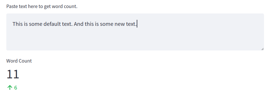
Fig. 2.2 Example of st.metric() Widget with Change#
Metric is a useful feature that allows us to create apps that display numerical data in easy-to-understand ways. But in other situations, a single qualitative number may not be appropriate. Here is where charts come in handy.
2.1.2. Plotting Basic Graphs with Streamlit#
We can plot basic graphs in Streamlit by passing a Pandas dataframe to different chart widgets in Streamlit. The first basic plot we can create is a line chart which we can create with the Streamlit widget st.line_chart(). We will be working with the Titanic dataset here that we first met in Part Two of this textbook. To prepare the data for visualization, we need to modify it a bit and group everything by the specific value that we want to plot. In our case, we want to visualize the number of survivors for different age groups on the Titanic. We can prepare our dataframe with the code below.
df = pd.read_csv("data/titanic.csv")
df = df[["Age", "Survived"]]
chart_df = df.groupby(["Age"]).sum()
chart_df["Age"] = chart_df.index
2.1.2.1. Line Charts with st.line_chart()#
Once we have created our new chart_df, we can pass it to st.line_chart(). Here, we will pass the entire dataframe as the first argument and specify our x axis and y axis on the graph. In our case, we want to view the Age column on the x axis and the Survived column on the y axis.
st.line_chart(chart_df, x="Age", y=["Survived"])
The output will look like this:
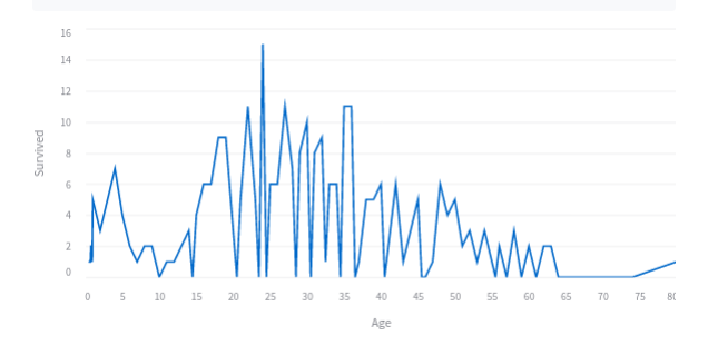
Fig. 2.3 Example of Streamlit Line Chart#
2.1.2.2. Bar Charts with st.bar_chart()#
Likewise, we can present this same data as a bar_chart with the widget st.bar_chart(). This will take the same arguments as above.
st.bar_chart(chart_df, x="Age", y=["Survived"])
The output will look like this:
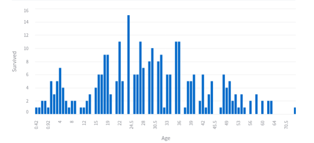
Fig. 2.4 Example of Streamlit Bar Chart#
2.1.2.3. Area Charts with st.area_chart()#
And finally we can also use the same arguments to create an area chart with the st.area_char() widget.
st.area_chart(chart_df, x="Age", y=["Survived"])
The output will look like this:
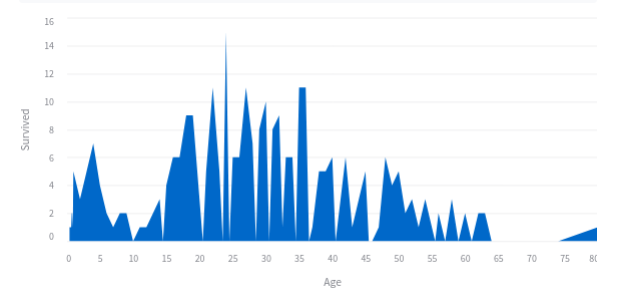
Fig. 2.5 Example of Streamlit Area Chart#
2.1.3. Map Charts#
A lot of digital humanities data is geospatial, or data that can be plotted on a map. Streamlit affords the ability to map geospatial data in several different ways; first, via the standard st.map() widget and second via the third-party chart libraries. Regardless of the library used, you will want to prepare your data well where your coordinates are labeled as either lat or latitude for the latitude and lon or longitude for the longitude. For this demonstration, we will be working with data from South Africa’s Truth and Reconciliation Commission that we met in Part Four of this textbook when we explores Social Network Analysis.
In order to prepare the dataframe, we can use the following code:
df = pd.read_feather("data/trc")
df = df.dropna()
df = df[["full_name", "long", "lat"]]
df["lat"] = pd.to_numeric(df["lat"], downcast="float")
df["long"] = pd.to_numeric(df["long"], downcast="float")
df.columns = ["full_name", "lon", "lat"]
2.1.3.1. Creating Maps with st.map()#
Once the data is prepared properly, we can then graph it with the standard Streamlit widget st.map() with a single line of code:
st.map(df)
The output will look like this:
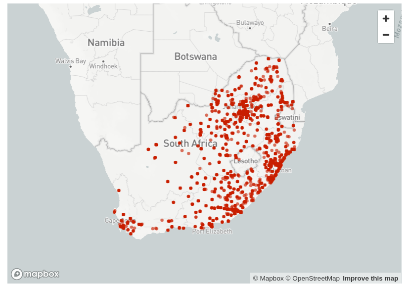
Fig. 2.6 Example of st.map() Òutput#
Each node on this graph is a row in the dataframe. This is an interactive map that users can zoom in to each node on the graph. While this is useful for users to get a sense of the geospatial data quickly, the Streamlit st.map() widget is limited in what it can do.
2.1.3.2. Third-Party Maps - An Example with PyDeck#
For more advanced mapping features, you will need to rely on third-party libraries. Fortunately, Stremalit has wrappers pre-designed so that you can leverage the power and versatility of these other libraries all within your application Python file.
For our purposes, we will use Streamlit’s built in PyDeck wrapper with the st.pydeck_chart() widget. The code below will create a similar graph, but note that because we are creating a PyDeck map, rather than a standard Streamlit map, we can leverage the full power of the PyDeck library, including giving tooltips that pop out for each node, the radius of our nodes, the degree to which they come off the map in 3 dimensional space, the pitch of the map, and the default zoom.
st.pydeck_chart(pdk.Deck(
    map_style=None,
    initial_view_state=pdk.ViewState(
        latitude=-25.97,
        longitude=30.50,
        zoom=5,
        pitch=0,
    ),
    layers=[
        pdk.Layer(
            "ScatterplotLayer",
            df,
            pickable=True,
            opacity=0.8,
            stroked=True,
            filled=False,
            radius_scale=6,
            radius_min_pixels=1,
            radius_max_pixels=1000,
            line_width_min_pixels=5,
            get_position="[lon, lat]",
            get_radius="radius",
            get_fill_color=[255, 140, 0],
            get_line_color=[255, 140, 0],
                ),
    ],
))
The output will look like this:
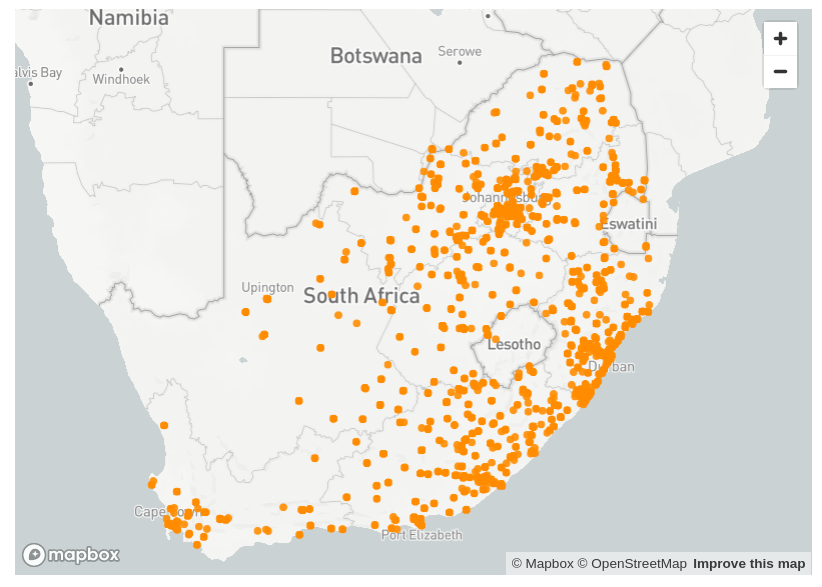
Fig. 2.7 Example of Streamlit PyDeck Map#